We have completely redesigned the AICODESIT website. From the first prompt on the homepage to the details of a template, the public site now shares one visual identity: dark surfaces, electric blue accents, clearer typography and controls with a little more depth.
The idea behind the refresh is simple: the website should feel like it belongs to the product you are here to use. Less visual noise, more consistency, and a clearer path from discovering AICODESIT to building something with it.
A homepage built around your next idea
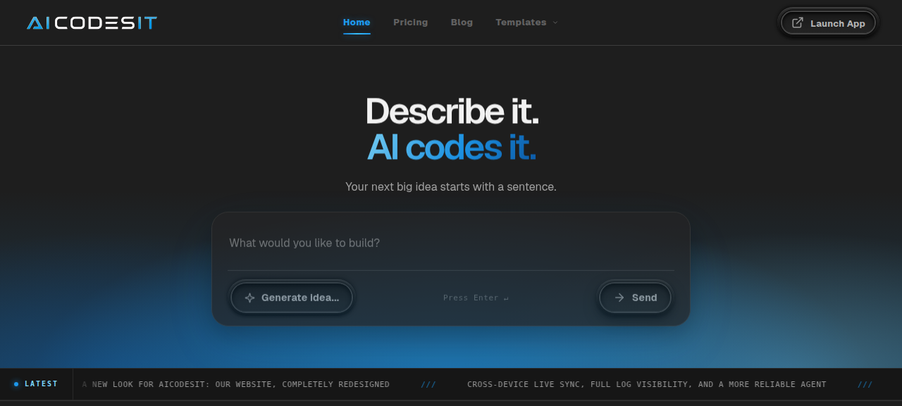
The new homepage puts the starting point front and center: Describe it. AI codes it. A blue glow, a bold headline and a focused prompt box make the invitation straightforward. Tell us what you want to build.
The rotating headline brings that invitation to life in multiple languages. If you need a little inspiration, the idea generator can suggest a starting prompt. If you already know what you want, just type it and get started.
One design language, across the site
Rather than giving each page its own unrelated look, we have brought the website together around a shared set of details:
- Charcoal backgrounds and layered panels that give content room to breathe.
- Electric blue accents and soft gradients that connect headlines, links and key actions.
- Geist typography for clean headings and readable body text, paired with compact monospace labels for supporting information.
- Tactile pill buttons with inset rings, subtle shadows and blue highlights.
- Responsive layouts and restrained motion, with reduced-motion preferences respected.
The result is a website that feels more coherent as you move between pages, without making every page look identical.
A proper home for updates and guides
The blog is now the AICODESIT Newsroom. A lead story, a top-stories rail and a browsable article archive make it easier to discover what we are shipping and what is worth reading next.
Topic filters help you find product updates, comparisons and practical guides without scrolling through everything. The newsroom uses the same dark-and-blue styling as the homepage, so reading about the platform feels like part of the same experience.
A more connected template experience
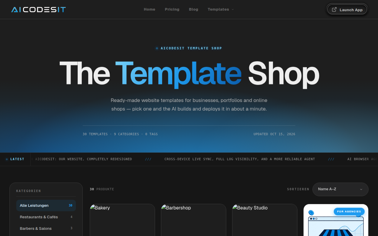
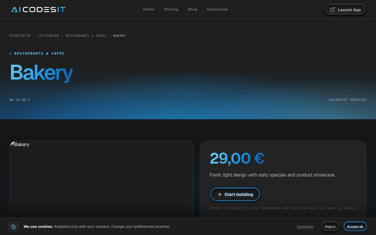
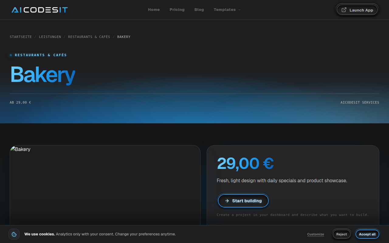
The template shop and individual product pages have been brought into the new visual direction too. Product details now pair a prominent title and blue-gradient accents with a dedicated image area, a clearer information panel and a direct action to start building.
Related recommendations and longer product descriptions follow the same styling. Whether you are browsing for inspiration or looking closely at a particular template, the experience should feel connected from start to finish.
Even the small details belong
The cookie banner and preferences panel now match the rest of the site, with charcoal surfaces, Geist typography, blue highlights and tactile controls.
This is a visual refresh, not a change to your choices: you can still accept, reject or customize optional storage, and reopen your preferences through Cookie settings.
New look. Same starting point.
This announcement is about the website redesign, not a new pricing plan or a change to how you build. The goal remains the same: help you turn an idea into a working website or application with AI.
Take a look around. Explore the homepage, browse the templates, or catch up in the newsroom. When inspiration strikes, start with a prompt.